
Listing Image Sequence Planning
A listing can contain attractive images and still leave shoppers unsure what they are seeing. The recurring problem is usually sequence design: several views repeat one job while questions about contents, scale, use, or detail remain unanswered.
Plan each product listing image around one visible shopper question. Treat the order as a reviewable framework, not a proven formula; the defensible arrangement depends on the product, intended format, and named marketplace.

Give every image a distinct job
A useful sequence moves from recognition to informed inspection. The opening view should identify the offer before the title, price, or description carries the explanation. Later views can add scale, context, detail, and clarifications without making the viewer reconstruct the product from separate fragments.
For a sticker sheet, decal set, or clipart bundle, show the pack structure before isolating every motif. A full-pack view establishes the relationship between the anchor motif and supporting motifs; close-ups can then reveal details that disappear in the overview.
- Recognition: identify the complete offer or principal product.
- Collection structure: show how the motif family holds together.
- Scale reference: provide a cue for physical size when size affects the decision.
- Use context: show a relevant application without replacing direct product evidence.
- Detail inspection: enlarge a feature that does not survive thumbnail view.
- Quantity and accessories: make the item count and included components visible.
- Objection handling: address a likely misunderstanding about material, format, personalization, or delivery.
Write the image job beside each asset during planning. If two views both claim to show the product clearly, compare them at thumbnail size and remove the weaker repetition or give it a narrower role.

Build the sequence around the largest source of confusion
A recognition-first pattern often suits a simple collection, but it is not a fixed order. A product with installation, fit, count, or format concerns may need those facts earlier than a lifestyle scene.
1. Open with an identifiable product view
Use the first image to show what the shopper is evaluating. For a pack, that may be the full sheet or a clearly arranged group of individual stickers. For a digital clipart bundle, it may be a clean overview of the included artwork rather than a staged application.
Inspect the image after reduction. The anchor motif should remain identifiable, the main silhouette should hold together, and the collection should not collapse into an indistinct cluster. Fine outlines, narrow borders, and closely spaced motifs require more than full-size inspection.
A quiet first view can still carry enough information. Reduce props and decorative text when they compete with product recognition, particularly where the marketplace preview gives the image little display area.
2. Establish the pack or collection structure
The next view can explain how items relate to one another. This matters when the offer includes several motifs, color variations, sticker sizes, or coordinated clipart elements.
Compare the anchor motif with its supporting motifs. They should remain distinguishable without making the pack feel unrelated. Repeated silhouettes, nearly identical poses, or crowded spacing can make a larger collection appear less varied than intended.
The collection view should answer what belongs together. It should not merely repeat the opening image from a different angle.
3. Add scale when isolated images invite misreading
Scale belongs early when physical size affects the purchase decision. A small decal, sticker sheet, or label may look substantial in isolation and ambiguous in a decorative scene. Use a reference that matches the intended product format and does not obscure the item.
Record the stated dimensions separately, then check that the visual cue does not contradict them. Any presentation rule remains dependent on the current marketplace or production requirement.
For digital assets, the question changes from physical dimensions to file contents, transparency, resolution, or included formats. Terms such as PNG and SVG describe possible workflow requirements, not universal requirements for every bundle. Confirm the actual deliverables in the relevant source terms.
4. Show use context without replacing product evidence
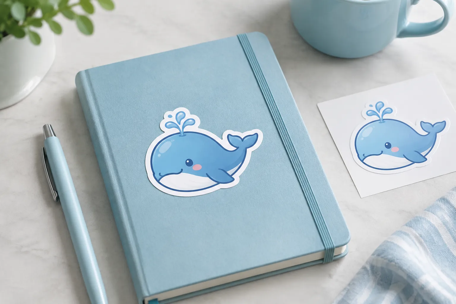
A lifestyle image can show where a design might be used: a decal on a notebook, a sticker on packaging, or artwork in a planner-like setting. It offers context, but it remains a preview.
Props, shadows, perspective, and surface texture can alter apparent scale or edge behavior. A rendered placement may suggest how the collection could look while providing no proof of final material appearance, cut-edge clearance, or physical application result.
For that reason, context normally follows a clear recognition or collection view. The shopper should not have to infer the actual offer from a staged scene.
5. Reserve close-ups for real inspection questions
A detail view earns its place when reduction hides information. Use it for a small facial feature, line boundary, finish, pattern, lettering, or motif separation that cannot be judged in the full-pack image.
If a close-up reveals an edge, inspect whether the visible border matches the intended cut edge. If it shows a print surface, separate what appears in the preview from what still depends on the printer, material, or export.
A polished close-up confirms only what is visible in that image. It is not production evidence by itself.
6. Clarify quantity, contents, and accessories
Quantity errors can begin as layout errors. Items placed too close together may be read as one piece, while a spread-out arrangement may imply more components than the offer contains.
Show the stated quantity in a way that can be counted or cross-checked. Display included accessories distinctly, and do not let a prop or mockup make a non-included item appear part of the offer.
Platform guidance may define narrow rules for quantity disclosure, accessories, overlays, or the first image. Those rules belong to the named marketplace and its current seller documentation; one platform’s guidance is not a general marketplace standard.
Review the sequence at thumbnail size
Thumbnail review is a separate condition, not merely a smaller full-size inspection. A composition can look balanced on an artboard and lose its anchor motif, outline, contrast, or quantity cue after reduction.
Create a review pass using the displayed ratio and likely crop. Inspect the first image before reading supporting text, then view the sequence as a row or grid because neighboring images affect repetition and variety.
- Can the viewer identify the product category and offer type?
- Is the anchor motif still visible?
- Do the main silhouette and border remain distinct?
- Does the collection read as a pack rather than unrelated fragments?
- Is contrast sufficient against the image background?
- Can the stated quantity and included components be checked visually?
If recognition fails, another close-up may not solve the problem. Revise the first composition, spacing, contrast, or crop tolerance first.
Inspect likely crops, not only the working canvas
A platform preview may crop an image differently from the working file. Look for clipped motifs, disappearing borders, and text or quantity cues placed too near the edge. A crop-tolerant composition preserves its main recognition signal even when some background is removed.
Review the displayed result after upload or within the available draft workflow. The live preview is the relevant presentation condition, although exact behavior depends on the marketplace and account context.
Compare adjacent images for repetition
Gallery-level cohesion does not require identical images. Keep a consistent visual system for background, border treatment, or color relationships while changing the informational role from view to view.
Five images showing the same pack from nearly the same distance spend the sequence without answering new questions. Alternating unrelated backgrounds creates the opposite problem. Compare adjacent views at the same thumbnail scale and state what new information each one adds.
Adjust the order to the product situation
Sticker sheets and decal packs
Lead with the complete offer or a clear group view. Follow with individual motif close-ups, a scale reference, and a use-context image when those views add information. Keep the quantity visible and prevent the arrangement from implying components that are not supplied.
If designs repeat too closely, use one later view to demonstrate their differences instead of repeating the full sheet. If they vary widely, let the collection view show the color or outline relationship that makes them read as one family.
Digital clipart bundles
Recognition may require a clean overview of the included artwork and a readable indication of bundle structure. Later views can clarify detail, format, transparency, or an example application, provided the displayed information matches the actual deliverables.
A digital mockup can demonstrate a possible use. It does not establish that every pictured surface, format, or file type is included. Keep preview content separate from the actual file offer and record the deliverables from the relevant source terms.
Products with installation or fit concerns
Dimensions, attachment points, fit, or application conditions may need to appear earlier than lifestyle context. Do not force a decorative image ahead of information that determines usability.
Use the category pattern as a planning hypothesis, then compare it with the questions a shopper must answer before purchase. The exact order depends on the product and the named marketplace.
Keep preview evidence separate from production evidence
A mockup, AI placement, stock scene, PSD or PSB template, transparent PNG, or SVG can support planning and presentation. It cannot prove material appearance, physical scale, cut-edge clearance, export behavior, device compatibility, rights, or final production readiness.
Keep a source record for assets used in the sequence. A label such as “free for commercial use” does not establish permission for a particular asset, derivative, or listing use. Confirm the current source terms rather than inferring rights from a marketplace snippet or asset page.
Inspect the export instead of relying on the design preview. Confirm transparency, visible edges, resolution, and intended format according to the applicable production or delivery requirement. These requirements vary by workflow, so a general file label should not be presented as a universal standard.

A repeatable product listing image review pass
- Name the job. Write one shopper question beside every image.
- Check the first view. Confirm that the offer and anchor motif survive thumbnail view.
- Compare the pack. Inspect motif coverage, silhouette, outline, border, contrast, and spacing.
- Test likely crops. Look for clipped edges, lost quantity cues, and displaced focal points.
- Verify scale. Compare the visual cue with stated dimensions or digital deliverables.
- Separate context from proof. Mark lifestyle scenes, mockups, and generated placements as previews.
- Confirm contents. Cross-check quantity, accessories, variations, and pictured components.
- Review the export. Inspect transparency, visible edges, and the intended format.
- Check the platform preview. Review the displayed result after upload or in the available draft workflow.
- Record dependencies. Note the marketplace, category, material, printer, cutter, or delivery requirement that could change the decision.
Remove the title and description temporarily. If the sequence still distinguishes the offer, scale cues, contents, and main differences, it is doing useful planning work.
Common sequence problems and practical revisions
- The first image is a lifestyle scene, but the product is hard to identify. Reduce the scene’s role and move a clearer product view forward.
- Every image shows the full pack. Assign later views to detail, scale, quantity, or objections. Keep a second full-pack image only when it answers a different question.
- The pack looks crowded at thumbnail size. Increase spacing, simplify the arrangement, or separate the anchor motif from supporting motifs.
- A mockup looks more convincing than the product view. Label it as a preview and place direct product evidence where the offer is first recognized.
- The quantity is present but difficult to count. Rework grouping and spacing, then compare the visible arrangement with the stated offer.
- The sequence follows a platform pattern but not the product’s questions. Apply documented platform constraints, then return to recognition, scale, context, detail, and contents.
Final decision frame
A defensible product listing image sequence is not the one with the most images or the strongest single mockup. It is the sequence in which each view adds a distinct, inspectable piece of information and remains accurate when reduced, cropped, previewed, and compared with the actual offer.
Plan around the product’s largest source of confusion. Then inspect the anchor motif, supporting motifs, scale, quantity, crop, detail, context, export, and platform preview as connected decisions. Route unresolved marketplace, printer, cutter, file, or rights questions to the relevant current source or format-specific check.