
Pack Mockups and Marketplace Listing Review
A sticker listing mockup has one job before it has a visual style: make the pack understandable.
At thumbnail size, a buyer should be able to recognize the collection, distinguish its main motifs, and understand what kind of product is shown. Larger listing images can then answer questions about contents, variations, scale, format, and delivery. A polished scene can support that explanation, but it cannot replace it.

The review works best as a sequence of decisions:
- Concept: define the theme, audience, and visual premise.
- Collection review: check whether the motifs belong together and provide useful variation.
- Production review: inspect artwork, spacing, transparency, cut boundaries, and exports against the selected workflow.
- Listing review: confirm that the images show what the buyer receives without hiding, enlarging, or implying details that have not been established.
The earliest unresolved decision should control the next review pass. Refining a lifestyle scene has limited value when the pack itself cannot be read at small size.
Start With the Available Artifact
The right review depends on what already exists. A sketch or motif board can support a concept review. A transparent export can support checks for silhouette, spacing, and file cleanliness. A provider preview can reveal layout or file problems. A rendered scene can support presentation review. None of these artifacts answers every later question.
| Review state | What it means | Typical evidence |
|---|---|---|
| Established | Visible or directly stated in the current material. | Artwork, export, listing text, or source terms. |
| Observable | Can be checked by viewing, comparing, measuring, or inspecting. | Thumbnail readability, silhouette, spacing, crop, and label matching. |
| Variable | Depends on a marketplace, printer, material, cut method, or delivery format. | Image behavior, provider requirements, physical finish, or file limits. |
| Unresolved | Assumed but not shown, measured, exported, or confirmed. | Final physical scale, actual cut edge, included items, or current platform rules. |
A clean mockup may establish the intended relationship between motif colors and the background. It does not establish the physical finish, exact cut edge, delivered backing paper, or final size. Those questions require different evidence.
Begin by identifying the first unresolved dependency that could invalidate later confidence. This keeps the review tied to the current artifact instead of treating every planning lane as equally mature.
How a Sticker Listing Mockup Should Read
A sticker listing mockup may combine artwork with a surface, hand, package, desk, planner, device, or other contextual element. A lifestyle scene and a clean product view answer different questions: one communicates context, while the other makes the pack easier to inspect.
The scene is helping when it adds context without becoming the subject. Review it against the intended use:
- Can the main motifs be identified without zooming?
- Does the scene hide any important item or cut edge?
- Does perspective make one sticker appear much larger than another?
- Do props, shadows, or crops cover a relevant feature?
- Does the background reduce contrast around pale or thin artwork?
- Could a buyer mistake a decorative prop for an included item?
- Does the image communicate a physical product, a digital file, or only a concept?
A realistic-looking scene may still be a weak listing image if it makes the pack difficult to inspect. Visual appeal should support product understanding.
Review Motif Coverage Before Scene Selection
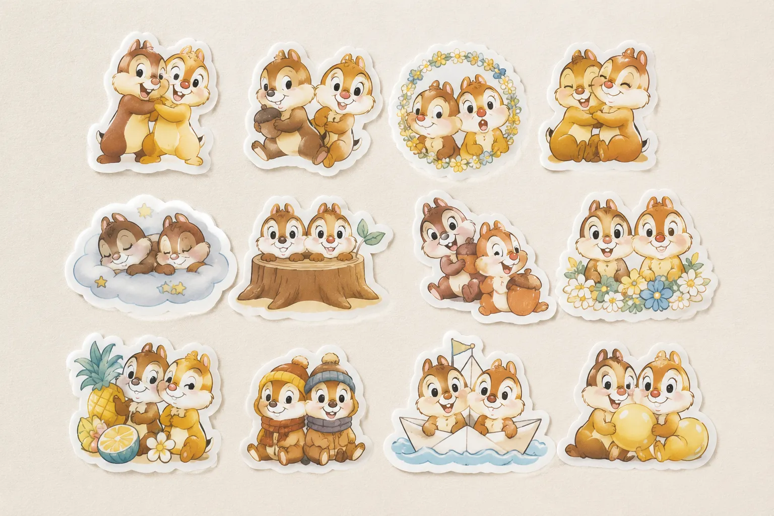
Collection-level cohesion starts with motif coverage. An anchor motif gives the pack its strongest recognition. Supporting motifs extend the theme without competing with it. For example, a hypothetical garden collection might use an illustrated watering can as its anchor, with leaves, seed packets, gloves, labels, and small tools as supporting motifs.
Check the collection at two levels:
| Level | Questions to review |
|---|---|
| Collection | Does the theme remain recognizable together? Are color, outline, border, and rendering choices consistent? Does the pack offer related uses rather than near-duplicates? Is there a visible visual center? |
| Motif | Is each silhouette identifiable without fine interior detail? Does the outline separate it from nearby items? Are small gaps preserved? Do repeated shapes differ in pose, angle, expression, or function? |
A pack can look cohesive while offering too little variation. It can also contain many different motifs that fail to read as one collection. Compare both conditions under the same format and viewing context.
Test Marketplace Thumbnail Readability
A marketplace thumbnail is a compressed summary of the product. The first test is not whether the artwork looks attractive at full resolution. It is whether the collection premise survives the likely small display.
Create a review copy using the approximate aspect ratio and crop expected by the target marketplace. Keep important content within a sensible crop-safe area, then verify the current platform's documented crop behavior. Image limits, ordering rules, and display behavior can change, so requirements should be checked for the relevant listing workflow rather than transferred between platforms.
At thumbnail size, inspect:
- the pack name or visual premise, if text is included;
- the anchor motif;
- the difference between major variations;
- the outer silhouette of the pack;
- contrast between artwork, border, and background;
- any essential label explaining physical or digital delivery.
If the pack disappears at thumbnail size, inspect the cause before enlarging everything. The problem may be an oversized background, excessive empty space, weak contrast, tiny motifs, or a scene that places the artwork too far from the viewing plane. Enlarging every element may create a crowded plate, while adding text may make the thumbnail harder to scan.
There is no strong sticker-specific thumbnail study in the available material. These are repeatable visual checks, not universal performance rules.
Plan the Listing Image Sequence
A listing image sequence should unfold information in a useful order. The first image introduces the product. Later images resolve uncertainty that the first image cannot handle without becoming crowded.

| Image role | Question it should answer |
|---|---|
| Main pack view | What collection or product is being offered? |
| Information panel | What is the broad format, delivery type, or key contents? |
| Variation plate | Which designs, finishes, sizes, or selections are available? |
| Numbered mapping | Which visible motif matches each variant or selection? |
| Related-bundle context | Are companion packs relevant, and are they clearly separate? |
| Actual-product evidence | What do the physical material, finish, scale, and cut edge look like, when those details matter? |
| Digital-download preview | What files or elements are included in the download? |
This is a planning example, not a marketplace rule. Image count, order, accepted formats, and display behavior depend on the selected platform and should be confirmed in its current documentation.
Do not make every image perform the same role. Several attractive scenes may leave the buyer without a complete contents view. Several dense information panels may explain the product while failing to show how the collection looks in context.
Ask one question of every image: What new buyer question does this image answer? When two images answer the same question, keep the clearer one or give one a more specific role.
Show Pack Contents and Variations Clearly
A pack contents plate should make the collection countable and comparable. Arrange motifs with enough spacing to inspect their silhouettes and borders. Shadows, props, overlapping stickers, and cropped edges should not conceal an item that the buyer is expected to receive.
When many small motifs are involved, use a second plate or detail view instead of shrinking everything until the forms merge. A variation map is useful when buyers select among designs, sizes, finishes, or separate files. Numbers, letters, or short labels can help when they remain readable and match the selection language used elsewhere in the listing.
- Can each visible variation be identified?
- Does each label refer to the correct file or selection?
- Are similar motifs separated enough to compare?
- Does the image show the complete set, or clearly state that it is partial?
- Are related bundles visually separated from the included pack?
- Does the checkout or selection terminology match the image terminology?
A variation plate shows what the listing intends to communicate. It does not establish that every displayed item is included unless the listing and delivery terms say so clearly.
Communicate Scale, Dimensions, and Format
Scale is easy to overstate in a rendered scene. A sticker beside a hand, notebook, laptop, or package may suggest relative size, but perspective and composition can distort that relationship.
Show dimensions separately from atmosphere. Use a dimension panel, scale reference, provider template, or clearly labeled comparison where appropriate. State what the measurement describes: the visible artwork, cut boundary, sheet, backing paper, or digital canvas.
| Question | What to confirm |
|---|---|
| Physical size | Whether the stated measurement describes the artwork, cut boundary, sheet, backing paper, or provider product area. |
| Product form | Whether the item is die-cut, kiss-cut, supplied on a sheet, or represented only in a mockup. |
| Digital dimensions | The file canvas, included formats, and whether transparency appears in the exported files. |
| Listing consistency | Whether dimensions and format labels match the product details and delivery terms. |
If a digital pack includes transparent PNG files, show a preview that makes transparency understandable without implying that the checkerboard or preview background is part of the download. Identify other formats according to the actual delivery terms.
A high-resolution mockup does not prove physical print or cut quality. Resolution, dimensions, transparency, and production suitability are related checks, but they are not interchangeable.
Separate Preview Evidence From Product Evidence
The central boundary in a sticker listing mockup is simple: a preview shows an intended presentation; it does not automatically show the delivered product.
For a physical sticker listing, a rendered scene may show proposed artwork and placement. It may not establish the final material, finish, physical scale, actual cut edge, backing paper, print-area coverage, or correspondence between the rendered scene and the delivered item.
For a digital download listing, a mockup may show how the artwork could be used. It should not imply that a physical sticker, printed sheet, package, or device is included unless the delivery terms state that.
Use a concise label when the image could otherwise be misunderstood:
- “Digital file preview”
- “Physical product example”
- “Artwork shown for scale”
- “Scene is a mockup”
- “Included designs”
- “Related pack shown separately”
Labels do not replace accurate listing details, but they help keep the image's claim within what it actually establishes. The FTC's general advertising guidance is relevant at this boundary: images and accompanying claims should not create an impression of product qualities that the preview does not support.
Keep Production Checks Provider-Specific
Production review begins after the pack and listing concept are sufficiently clear. Use the selected provider's file guidance, template, and preview rather than treating a general sticker rule as universal.
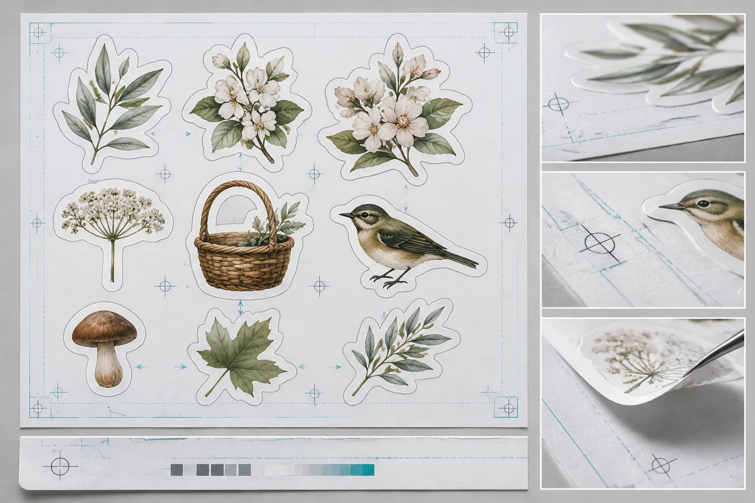
For example, Printify's sticker guidance discusses spacing, combined files, separated objects, file cleanliness, preview inspection, print-area coverage, and backing-paper interpretation. Those checks are useful within a Printify workflow, but requirements may differ by printer, material, product, cut method, or file process.
Use the provider preview to inspect:
- whether separated objects are interpreted as intended;
- whether the cut boundary remains clear;
- whether small spaces close up in the preview;
- whether specks, residue, or stray marks appear;
- whether artwork leaves unexpected unprinted areas;
- whether the backing paper changes the apparent size;
- whether artwork fills the intended print area;
- whether the preview matches the arrangement used in the listing.
A provider preview can reveal a file or layout problem. It is not physical-output testing. A clean preview does not certify the finished item, and a spacing example from one provider should not be presented as a universal threshold.
Keep dieline language tied to the selected provider's template. A dieline can serve as a dimensional or cutting-boundary reference, but the available material does not establish one universal sticker production method.
Run a Listing Preview Accuracy Review
Run the final review after the pack, export, provider preview, and listing images have been aligned. Repeat it after a motif revision, format change, mockup replacement, or marketplace presentation change.
| Pass | Checks |
|---|---|
| Visual accuracy | Current artwork, available variations, colors, borders, silhouettes, crop, scene details, dimensions, format labels, and related-product separation. |
| Evidence status | What is visible in the artwork, shown only in a mockup, stated in provider guidance, confirmed by the export, dependent on the marketplace, or still awaiting manual verification. |
Also check whether the scene hides or distorts a relevant feature, whether physical and digital contexts are separated, and whether any prop could be mistaken for an included item.
Separating these passes prevents a visually polished listing from carrying more certainty than the underlying evidence supports.
Choose the Next Review Lane
The root review should end with a route rather than an attempt to solve every detail at once. Choose the lane that matches the earliest unresolved dependency:
- Listing Mockup and Scene Selection: the scene may hide the product, distort scale, or confuse physical and digital context.
- Marketplace Thumbnail Readability: the pack is clear at full size but weak in the likely thumbnail crop.
- Listing Image Sequence Planning: the images look individually acceptable but fail to answer buyer questions in a useful order.
- Pack Contents and Variation Plates: motifs, variants, or bundle boundaries are difficult to count or map.
- Scale, Dimensions, and File Format Communication: the listing does not distinguish physical measurements, digital canvas dimensions, transparency, or included formats.
- Physical Product and Digital Download Preview Boundaries: a mockup could be mistaken for evidence of the delivered item.
- Listing Preview Accuracy and Correction Review: the pack or export has changed and the existing listing images may no longer match.
These are entry points into narrower reviews. They do not replace the selected marketplace's current rules, the provider's current requirements, or the actual delivery terms.
Common Review Mistakes
- Using one attractive mockup for every question. A scene may establish context but fail to show contents, variation, or scale. Assign each image a clear role.
- Shrinking the entire pack into one crowded plate. Completeness helps only when motifs remain identifiable. Split the view when small forms merge.
- Treating seller practice as marketplace policy. A seller workflow can explain why a concern exists, but it does not establish a platform requirement.
- Transferring one platform's image rules to another. Submission, crop, format, and display behavior may differ. Check the relevant platform directly.
- Calling a polished concept production-ready. Production suitability depends on the export, provider, material, cut method, and preview.
- Assuming a displayed size describes only the artwork. Confirm whether the measurement refers to the cut boundary, sheet, backing paper, provider area, or digital file.
- Treating commercial mockup language as evidence. Terms such as “realistic view,” “high resolution,” or “marketplace-ready” describe market claims. Confirm important details in the specific source terms or provider documentation.
FAQ
What is a sticker listing mockup?
It is a visual presentation of sticker artwork in a product or usage context. It may be a rendered scene, clean product view, variation plate, or another preview format. Its purpose is to communicate the collection, but it does not automatically prove the physical result or included delivery.
Should the first image be a lifestyle scene or a clean product view?
That depends on which uncertainty matters first. A lifestyle scene can establish context, while a clean product view usually makes the pack easier to inspect. Compare both at the likely thumbnail size and keep the one that communicates the collection more clearly.
How many listing images should a sticker pack have?
The available material does not establish a universal image count. Use enough images to answer the important questions about the pack, contents, variations, scale, format, and delivery type. Confirm current limits and behavior with the selected marketplace.
Can a mockup prove physical sticker quality?
No. A mockup can show intended artwork, placement, and presentation. Physical material, finish, scale, cut edge, backing paper, and print-area behavior require product-specific evidence or provider checks.
What should a digital sticker preview show?
It should show the artwork or file contents in a way that makes the delivery type clear. Identify included formats and transparency accurately, and avoid presenting physical props or printed objects as part of the download.
Are provider preview checks enough?
They are useful for catching file and layout problems, but they are not physical-output testing. Printify's guidance is concrete for its own workflow, while other providers may use different requirements. Confirm the current instructions for the selected product and production route.